Google launched expected products like Pixel Watch in the Google I/O 2022. Along with it, Google launched Pixel Tablet also. Google settled with Pixel Slate and other few products that utilize the Chrome OS. But, Google Tablet ultimately uses Android OS, and it can work better with new optimized Tablet UI versions. Finally, Google realized the hardware game is entirely different from the Software game, and they are slowly moving towards the Apple products approach. We can consider Google’s initiative in the Tablet sector is like a separate iPad OS. Google Tablet is yet available for retail purchases. But Google has already released many optimized apps for the Tablet UI version.
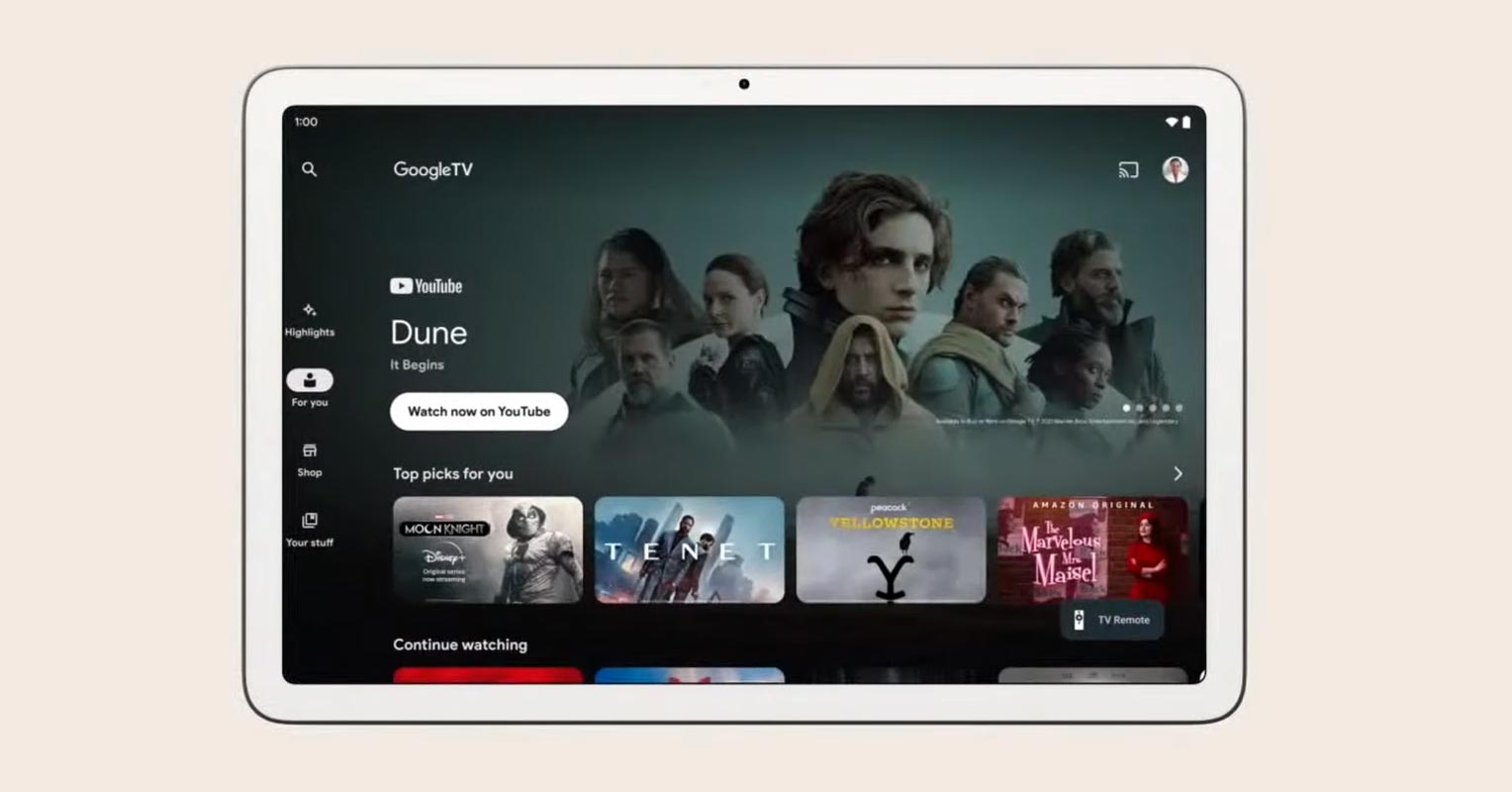
Separate Google Android Tablet UI
In the Google I/O 2022 keynote, Google stated that it would update at minimum twenty of its applications soon, offering a great tablet experience. They’re also expecting an array of third-party apps, including TikTok, Facebook, Zoom, and Canva, to follow suit.
A list of Google Apps with Exclusive Tablet UIs
They were short in highlighting the apps they’ll be updating; however, they offered several images of the applications. The image below shows how Google Duo, Google TV, Google One, Google Home, Google Maps, YouTube Music, Google Play, and Google Messages will appear. There are highlights of apps such as Maps, YouTube Music, Google Play, and Messages in their slides and a selection of third-party applications. In the I/O event, Google says there initially, 20+ apps will support the Android Tablet UI.
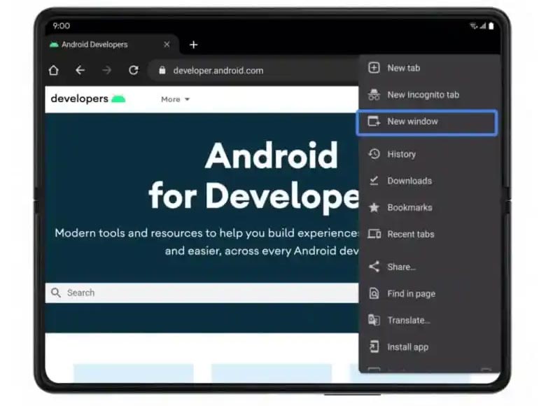
Google Chrome
The Essential Browser app, Google Chrome Tablet UI, gives the same desktop look with multiple windows support.
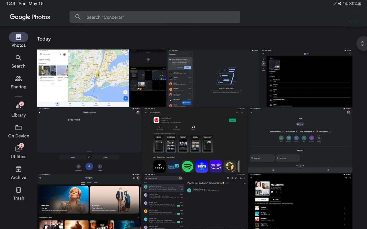
Google Photos
The Tablet version of Google Photos is not too different from the web UI. A navigation bar on the left side means that you will have a little more vertical content, and more tabs are displayed without feeling cramped as when compared to a bar at the bottom. One minor Material You tweak that Google has made in recent months has a pill-shaped symbol to highlight the tab you’re currently viewing instead of making the icon visible. Alongside Photos, Search, Sharing, and Library, You can also get easy access to On Device, Utilities, Archive, and Trash.
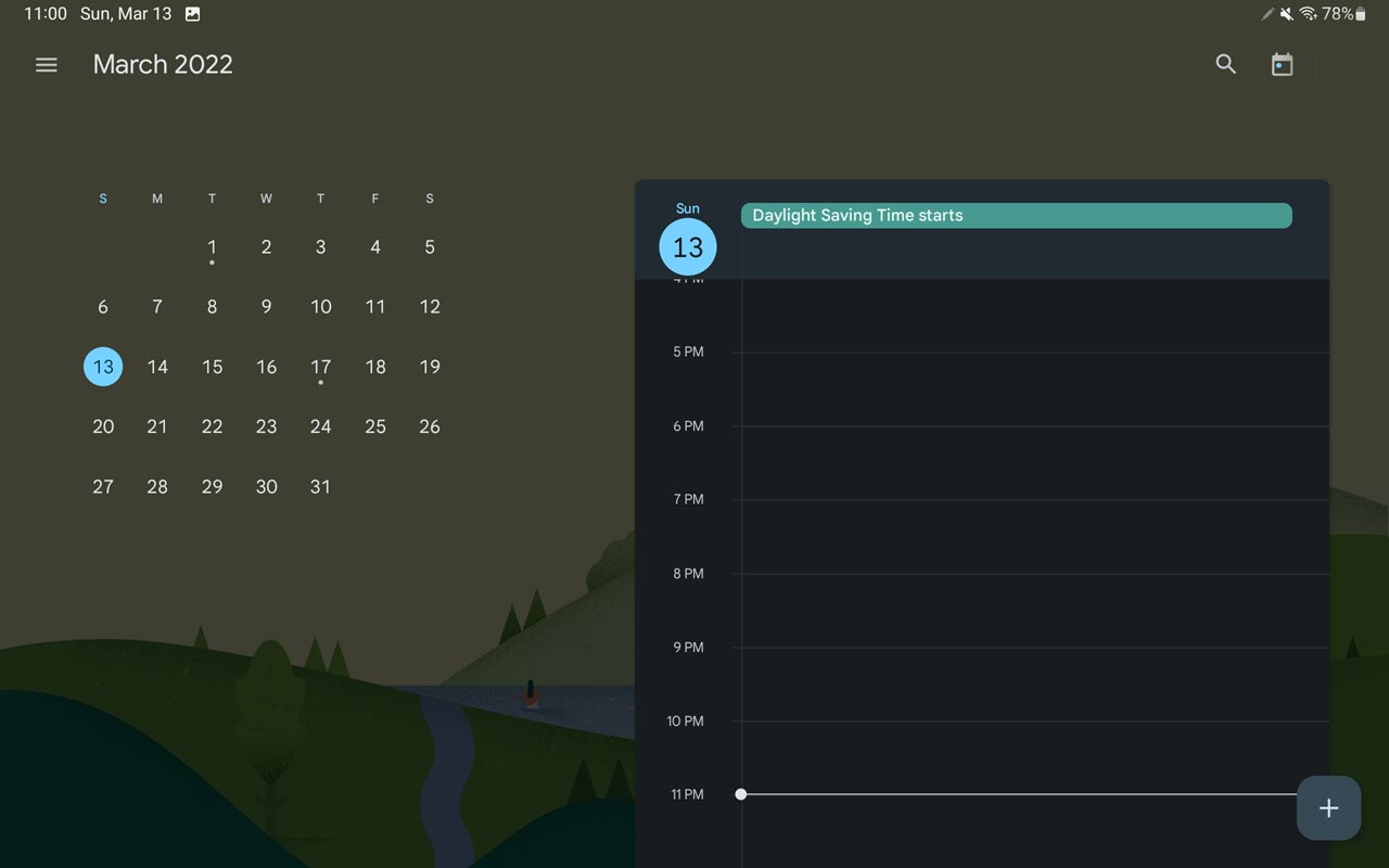
Google Calendar
Not many optimizations and changes compared with the Web version. But, the Great Day and Schedule view, where you see the whole month to the left and a schedule of events below, while illustrations make the background more lively.
YouTube
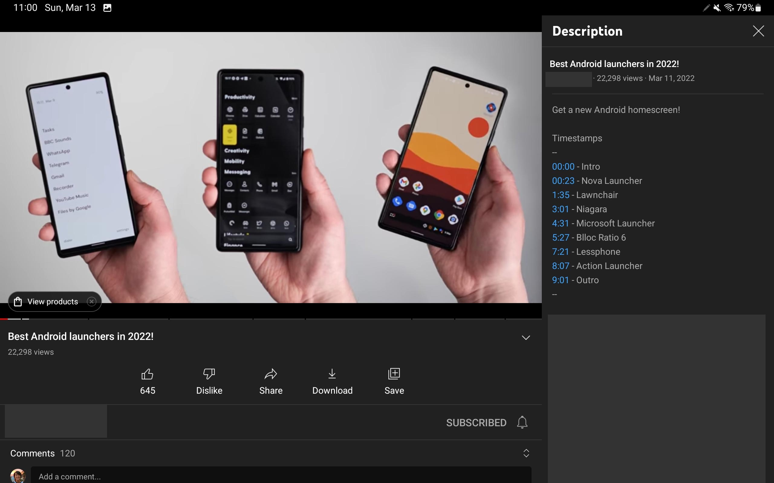
YouTube comes with Two columns view UI, and the Player gets additional features and options in the second column.
Google Translate
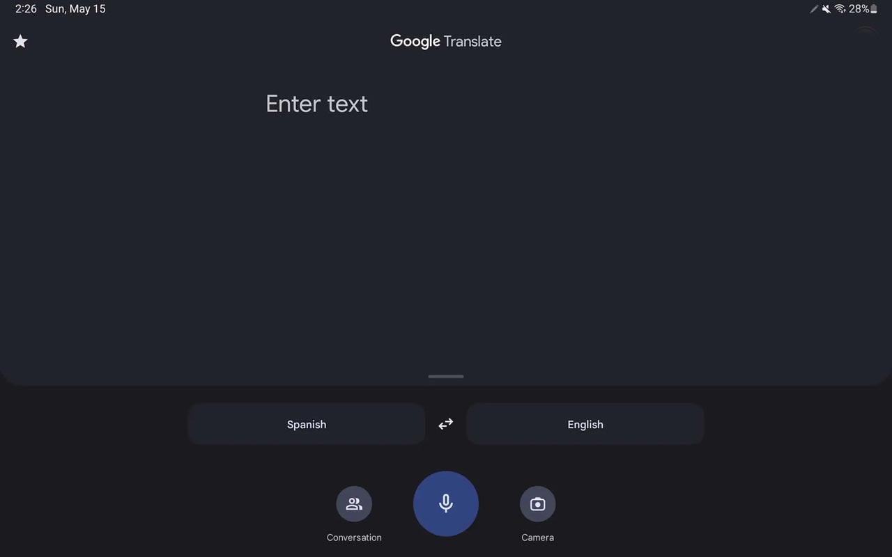
Translate already includes tablet-specific optimizations that were announced at the stage. The app should be small and not have lots of space due to its nature as a (physically) shared interface or tool.
YouTube Music
Google decided to implement the tablet-optimization process in YouTube Music. It will be available on Android and iOS at the beginning of this year. The first step was to shrink the images on the cover of the Home tab to allow you to get more content in the carousels ( Listen again to your favorites, Mix for you, and so on.) without scrolling. Another optimization is Now Playing’s, the dual-column view that has controls to the left and your Up Next queue on the right.
Other Apps with Android UI Support
Family Link: Instead of the navigator rail, Family Link looks to use an ever-displaying navigation drawer.
Google Home: A centered navigation rail, although it appears silly with only two tabs. Two columns could be more appealing.
Gmail: A navigation rail with drawer buttons on the top lets you see your labels and folders.
Google TV: Navigation rail, while you look out for the forthcoming highlights news feed as part of the more comprehensive Material You redesign.
Google Calculator: Two-column layout.
Google Clock: Navigation rail with a two-column layout.
Google One: Navigation drawer that makes the use of cards heavily in the body of the application.
Google Lens: Visual search on tablets today only can be used in portrait orientation.
Google Duo: Centralized control.
Wrap Up
Chrome OS is suitable for primary and Advanced tasks. But, Google should not force the OS on users in non-traditional ways. Chrome OS is not ideal for Tablet devices. That’s why Pixel Slate is not fallen under both Tablets and Laptop sectors, and it is confusing users. Introducing Fuchsia OS and slowly rolling out it to the Google Home devices is a great idea to make the unique ecosystem like Apple devices. In the long run, Google should be careful with hardware devices. Because They can’t patch or fix issues like the software updates. Separate Android Tablet UI is an excellent initiative for new device lineups. What are your thoughts about Android Tablet UI? Share your thoughts below.

Selva Ganesh is the Chief Editor of this Blog. He is a Computer Science Engineer, An experienced Android Developer, Professional Blogger with 8+ years in the field. He completed courses about Google News Initiative. He runs Android Infotech which offers Problem Solving Articles around the globe.


Leave a Reply