Most of the Social platforms base concept is fun. So, It should be like that. When a platform looks more professional, It will not attract users. In the long run, When a colorful platform comes, Users will move towards it. So, Along with the security and all other technical features, the Gimmick concept also needs to make the user stay on the platform. Recent Instagram Visual Refresh includes Logo Tweak, Custom Instagram Sans Font, etc. So, there is no option or feature in this update. It is purely UI design tweaks.

Instagram Visual Refresh
Instagram Refresh’s UI tweaks might not bring a fresh look to the app. However, there’s an even more significant alteration: Instagram created its typeface called Instagram Sans, which it plans to use widely throughout the future in both marketing and in the app itself. As the name itself, Instagram gives new life and focuses on our color scheme, typeface logo, colors, and other branding elements, with a fresh visual identity.
Instagram Sans Typeface

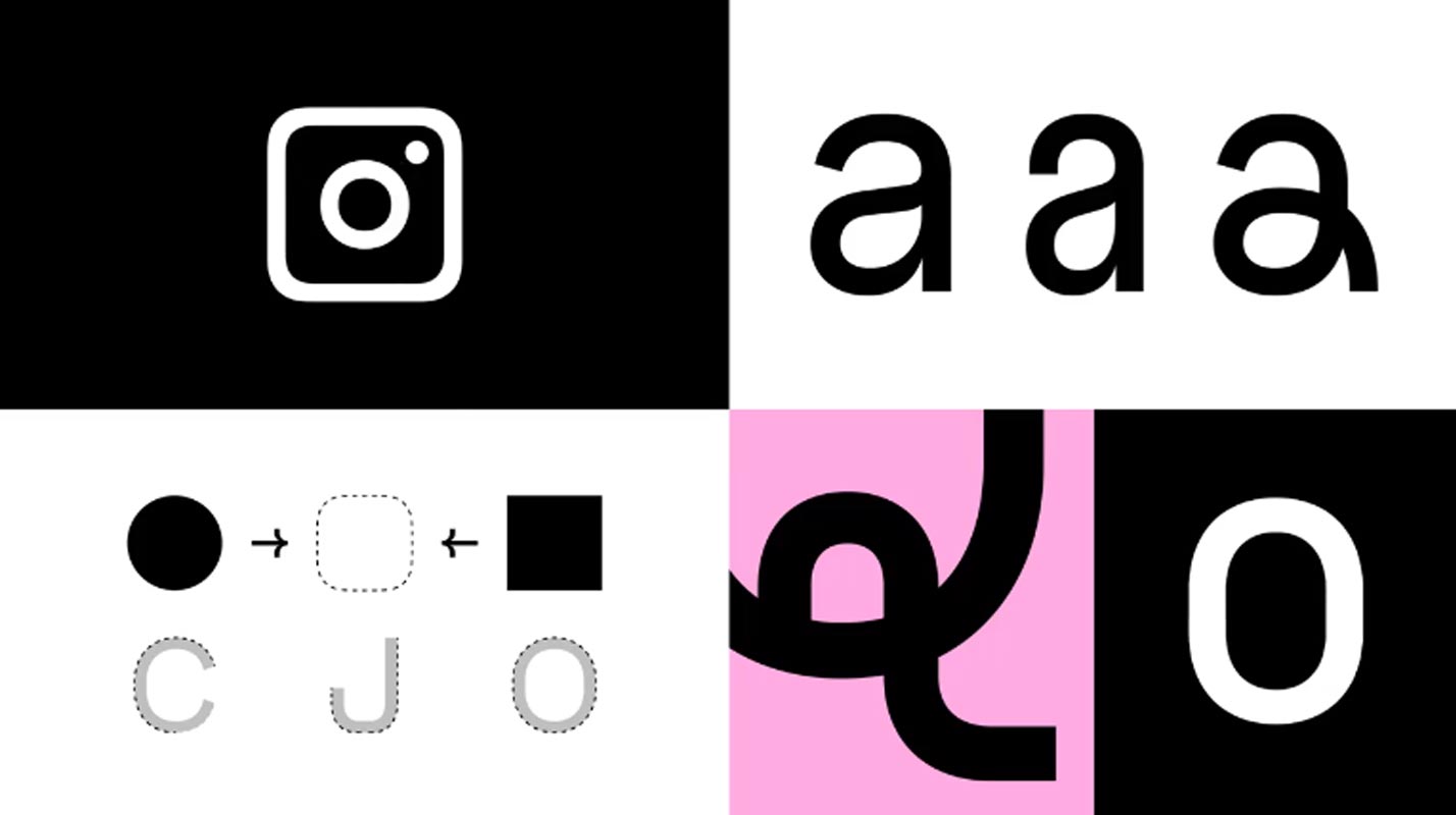
Instagram’s logo inspired Instagram Sans; Officials of Instagram said that it “reflects the form of the glyph and our dedication to simplicity and art.” (As they mentioned, hand-wavy.) It’s primarily designed to reflect the mix of circles and squares or, as Instagram affectionately refers to them, “squircles. As Instagram has always attempted to achieve its best, it’s the perfect pixel and hand-crafted with some minor details, such as the somewhat curved terminal at the end of the “t,” that makes it appear more human. The design has evolved from the cursive logo that Instagram has used for years in some areas.
What is remarkable is that it is unique to Instagram Sans?
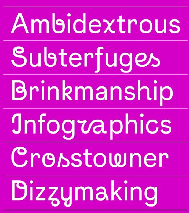
Instagram stated that it collaborated with linguists to ensure that the font is compatible with the most languages possible and includes script languages such as Thai or Japanese. Only an incline in the lowercase “Q” indicates that it’s a unique font in specific fonts. However, there’s Instagram SansScript. This font includes broad brushstroke-like strokes to virtually every letter, often to a fantastic effect (the lowercase “W” appears to be the logo of a highly trendy yoga center) and at times to utterly odd outcomes (the lowercase “r” isn’t at all like an actual letter).
How can Instagram Sans help Instagram?
One area where Instagram would like users to try Instagram Sans is Stories and Reels, where captions written using Sans Script will appear not like an uncut TikTok video. When vertical videos become commonplace, a sure consistency is evident throughout the social media landscape, and while a curly “x” might not alter the entire picture, it does change something.
Content First

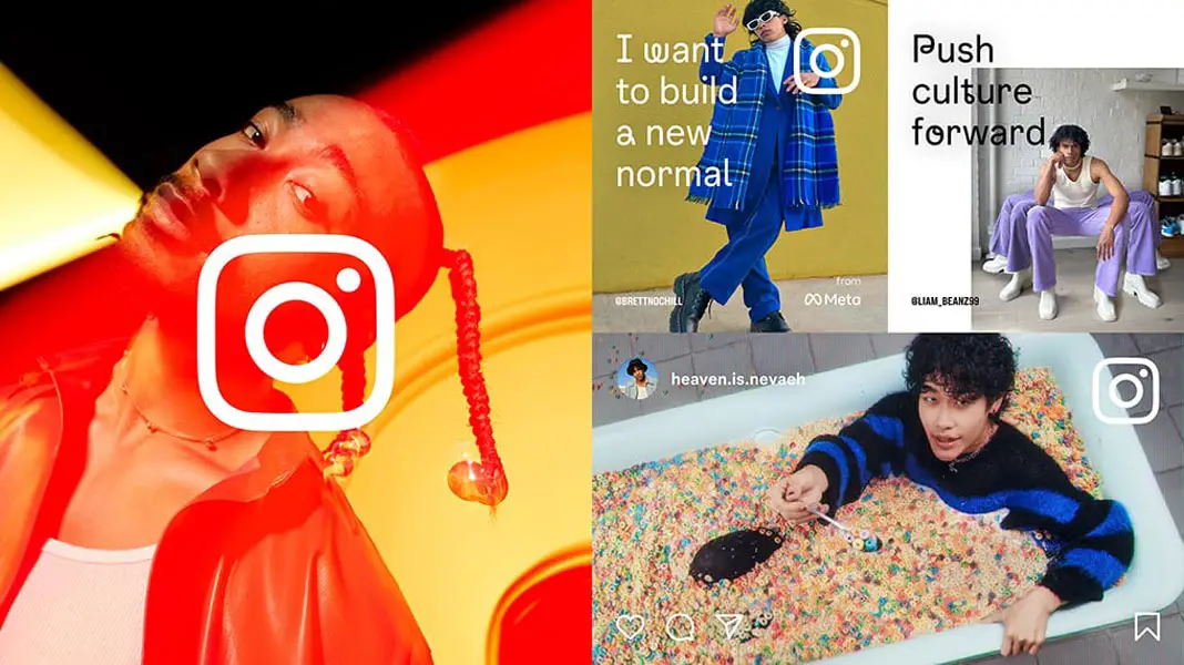
The new design system places content at the heart of our site, with simplicity and self-expression as the primary focus. Instagram’s new marketing layouts highlight full-screen imagery and reference the app experience. They also celebrate the creativity that we see every day in our community.
Wrap Up
The new Instagram Visual Refresh may not look like much change from the outside, but it can give you a new look in the usage. Instagram Reels considers natural alternatives to TikTok. Since TiokTok is banned in a few countries, Instagram has to provide colorful and thoughtful interactions and UI that attract users. Also, Consistently changing UI will provide users that the platform is improving visually. Thus the high follower’s celebrities stick with the platform. Did you try out the new Instagram Visual Refresh update? Share your thoughts below.

Selva Ganesh is the Chief Editor of this Blog. He is a Computer Science Engineer, An experienced Android Developer, Professional Blogger with 8+ years in the field. He completed courses about Google News Initiative. He runs Android Infotech which offers Problem Solving Articles around the globe.


Leave a Reply