Google Photos always receive small updates regularly. Since the updates are frequent and short, Most of the time, We don’t feel much change in the app and Web UI. But, After a long time now, Google Photos gets a redesign with Memories focus, a Map view, and a new icon. The UI receives noticeable change. The main focus of mobile apps is to deliver good memories from your photos. Also, the most requested feature Map view added in the new design, Which will show the overall heat map and interaction with the place. The icon, which is similar to the pinwheel, is slightly changed to a new design. But It remembers the old model. The features are rolling out slowly to users. So, We will get the complete update.
Memories focus Google Photos with the simplified redesign
The new design is simplified as much as possible. The home screen has Memories and recently taken photos with a timeline. The Memories row, moreover, looks like Instagram stories. Instead of the other personal stories, It will remember the best photos collection with different sets. You can find a different set of photos in the row. To get better results in the Google Photos Memories, you should give the face instructions about who is who like that and their names. Most of the time, Google Photos automatically detects the relevant faces. Sometimes it will ask the same person or not with two photos. When you optimized those faces in your free time, you will get a better experience.
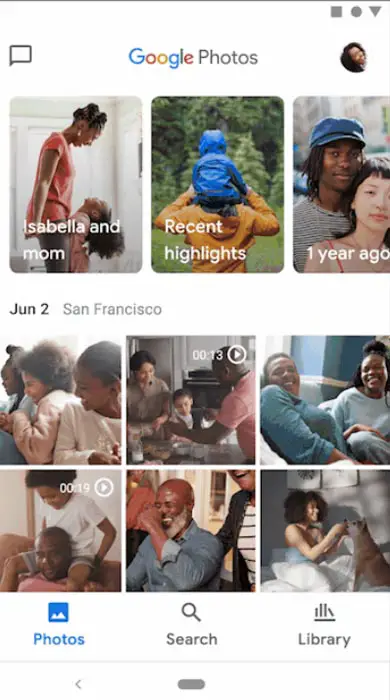
Main Tab- Photos
As usual, the main tab-Home screen contains the recently taken photos with a timeline. Before the recent photos, there is a separate row for Memories. The Memories can suggest Old year photos, Important moments, Pets, Or this day last month like that. It can also show the previous week’s photos based on the moments you have.
Search bar with People and Map view
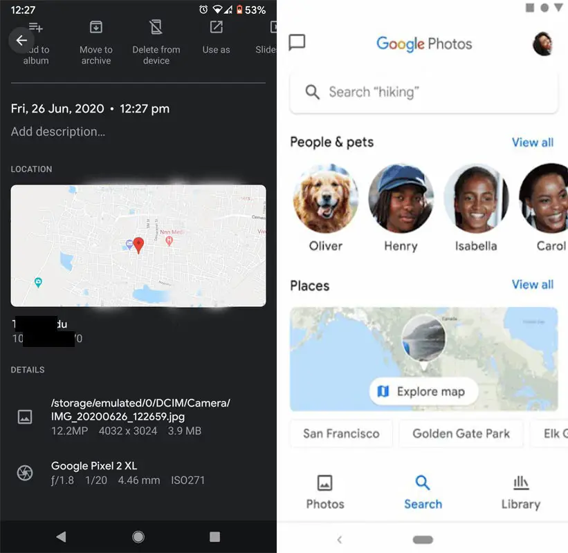
The search bar is separate now. Before the redesign, You can access the search bar from the home screen, which suggests people or recent search. Far, with the separate tab, everything that is related to the search goes here, including People, Pets, Map view. The Map view allows you to get all the images for a particular place. You should enable the location when you captured the photo in that place. Or Else Google Photos can’t get the location-based images. Google is smart. Most of the time, even if you didn’t enable the location, it can identify the nearby places with various factors.
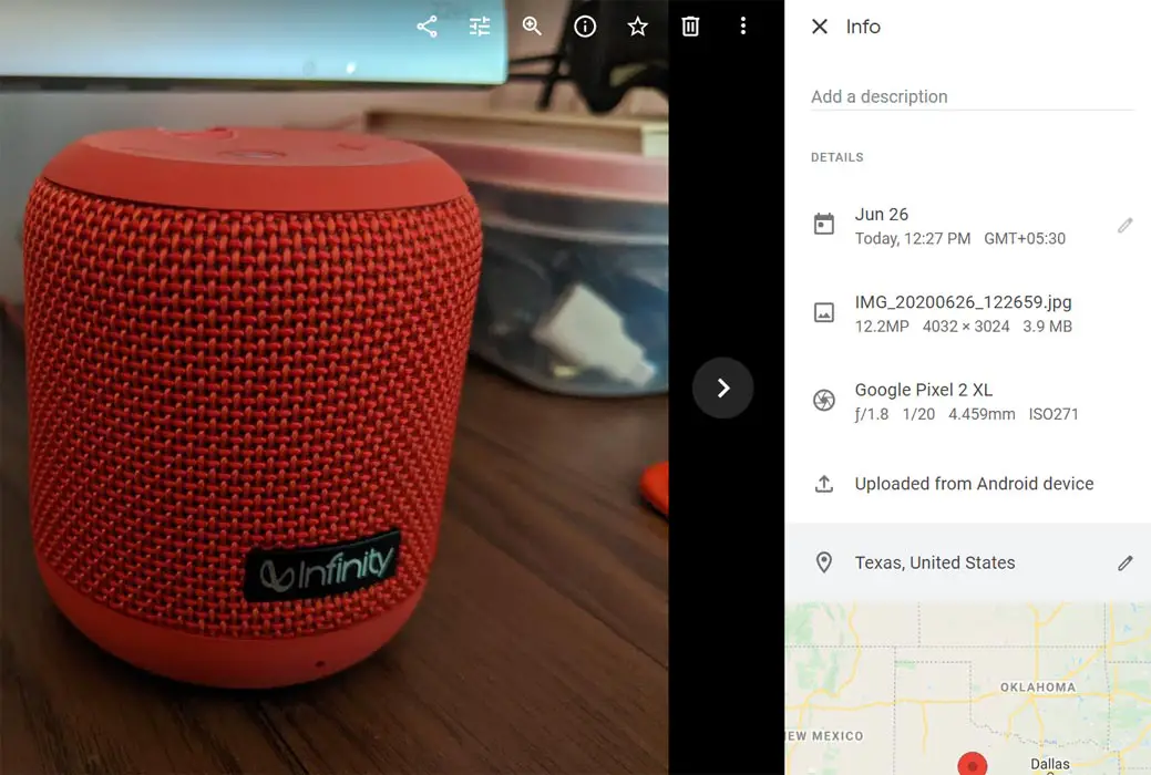
When you didn’t enable the location, You can add the place in the description in Web view. In some of the Android mobiles, the option is not available. You can use the PC/Web view of Google Photos to add or edit the location. Open the photo>info>Location>Edit.
Library tab
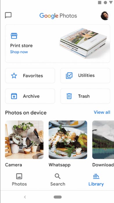
It is a collection of photos with respective folders. Instead of the timeline and name search, You can search the images with separate folders like WhatsApp, Camera, and Download like that. It will be useful when you can’t remember the photo’s name or date. You can go through the entire folder and can get the image you want. You can also backup your WhatsApp Photos and Video.
Google has a separate print service for your photos, and You can make a hard copy of your favorite images in the print store. Google only halts the Automatic print services trial. The regular Google Photos service is different, and You don’t need a monthly subscription for this service. The print of your photos starting from $0.25. For a single separate photo, you can collect the copies from CVS or Walmart. The album with softcover or hardcover starts from $9.99 for 20 pages, and Canvas images start from $19.99. You can customize all the photos by yourself.
Profile
The Bin, Archive, Utilities are moved to the Library folder. The remaining old Hamburger menu options like Backup and Sync, Notifications, Suggestions, and other options moved under profile. It includes the settings and frees up space options.
New Google Photos icon
![]()
The old Google Photos icon is a pinwheel inspiration. The new icon is a half-circle combination with the same pinwheel-like design. But they used light colors Instead of light and shadow of the same color. Simply, In the old icon, Google used a total of eight colors. 4 Bright colors and their heavy versions. In the new logo, they used only four colors. So, It doesn’t give a 3D look. It is simple but looks good.
Wrap Up
The success of the app depends on the spending time of the user. Even if Google photos are already a successful app, with the help of Memories, they can get more interaction time. On the user side, The updates make everything simple and useful. Every feature they rolled out is essential. Memories, New icon, New Search with Map view and New Library everything makes the redesign is considered as worthy.
One side, due to trending video conference solutions, Google is fighting with Zoom with its Google Meet. Some people thought Google is focusing less on their popular platforms and focus on new Platforms like Google Meet and Stadia. Yes, Google will always experiment with new Platforms. Recently they launched Keen- A Pinterest platform. But this kind of already existing platform redesign updates tells people that Google is still improving the best of it. What are your thoughts about the new redesign? Comment your experience below.

Selva Ganesh is the Chief Editor of this Blog. He is a Computer Science Engineer, An experienced Android Developer, Professional Blogger with 8+ years in the field. He completed courses about Google News Initiative. He runs Android Infotech which offers Problem Solving Articles around the globe.


Leave a Reply