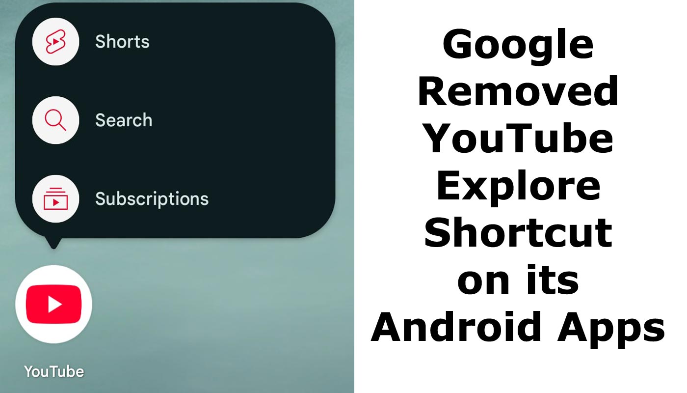
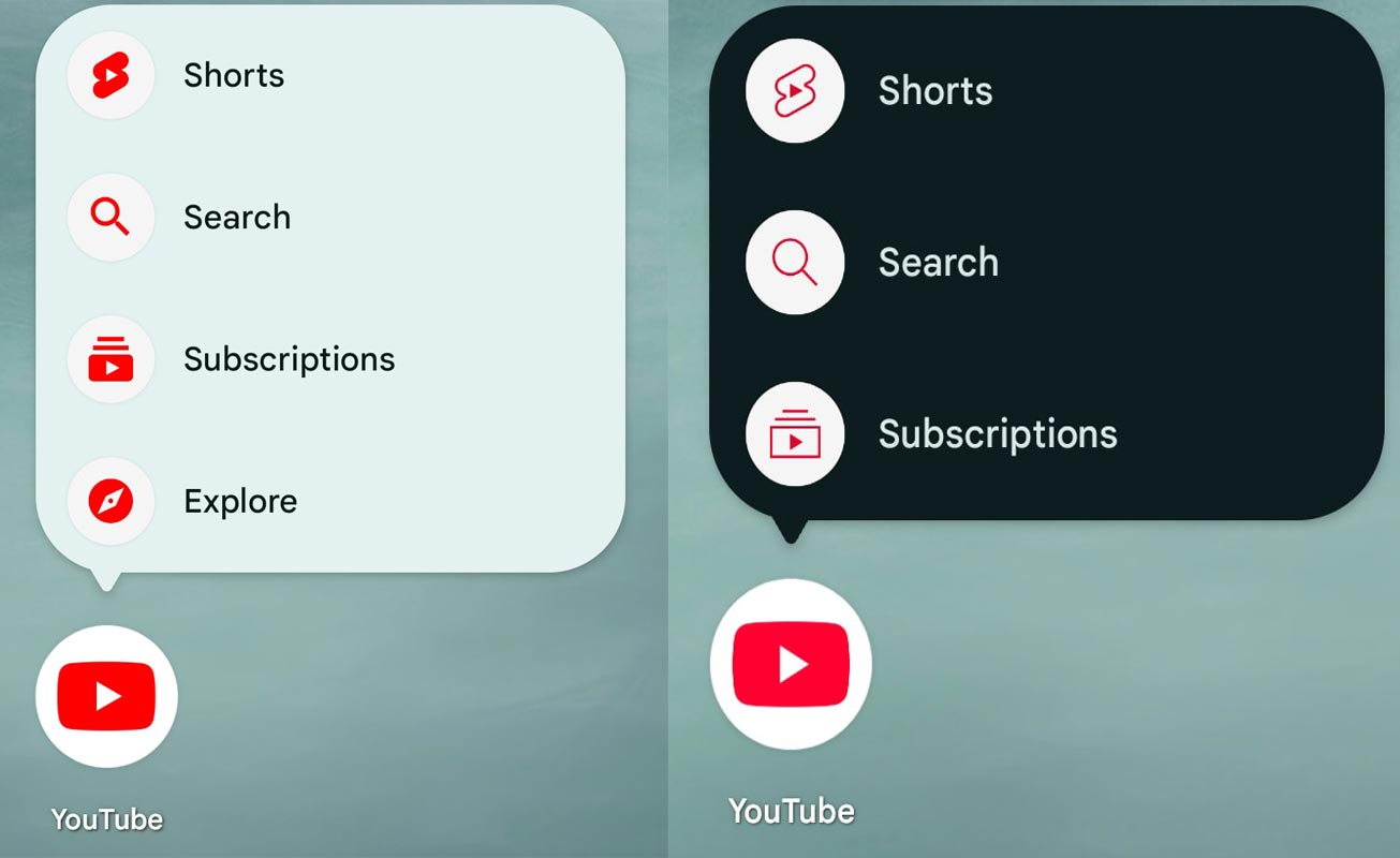
In a move that aligns with its ongoing efforts to streamline user interfaces and improve navigation, Google has updated YouTube’s Android app with a fresh design for the bottom navigation bar. Among the changes, removing the Explore shortcut has sparked curiosity among users. This update is part of YouTube’s broader initiative to enhance user experience and keep up with modern design trends. This article explores the nuances of the recent updates, including removing the Explore tab and the revamped bottom bar design, and what they mean for Android users.

The Redesigned Bottom Bar: A Modern Touch
The most notable change in YouTube’s Android app is its new bottom bar design, which features a blurred aesthetic that subtly allows the background to show through. This visual tweak enhances the app’s immersive experience as users scroll through their feeds.
Critical Updates to the Bottom Bar
- Blurred Background:
- The bottom bar now blends with the background, creating a seamless interface.
- This change makes navigation more intuitive and visually appealing.
- Minimalist Icons:
- The icons have been redesigned to adopt a more modern and streamlined appearance.
- Thicker outlines and rounded corners dominate the new design, making the icons more prominent yet subtle.
What Happened to the Explore Shortcut?
Google’s decision to remove the Explore shortcut from the bottom navigation bar has raised questions among users. Explore, previously a hub for discovering trending videos and new content, has been replaced with other navigation options.
Why Was Explore Removed?

Refocus on Core Features:
- By removing Explore, YouTube emphasizes core functionalities like Home, Shorts, and Subscriptions.
Simplified Navigation:
- The absence of Explore reduces clutter in the bottom bar, making navigation more user-friendly.
Explore’s New Location:
- The features previously housed under Explore, such as trending videos, are now integrated into other app sections.
The Updated Icons: A Closer Look
The icon redesign is a significant update, bringing the app a cleaner and more modern look.
Changes in Icon Design
- Home Icon:
- Features a bold yet simple design for easier recognition.
- Shorts Icon:
- Now boasts thicker, bolder lines to enhance its visibility.
- Create (+) Button:
- Enclosed in a gray circle, the Create button has shed its previous outline for a minimalist aesthetic.
- Subscriptions Icon:
- Simplified with rounded edges, this icon reflects the app’s streamlined approach.
- Profile Icon:
- Remains unchanged, maintaining its familiar appearance.
A Server-Side Update: What It Means for Users
The new bottom bar design and iconography are being rolled out as a server-side update. Users don’t need to update their apps manually; the changes will appear automatically with Android’s latest version, 19.45 of YouTube.
Availability
- Android: The update is currently live on Android devices.
- iOS: The changes have yet to be extended to iOS users, but future updates might bridge the gap.
User Reactions to the Changes
User feedback on removing Explore and the redesigned bottom bar has been mixed.
Positive Responses
- Improved Visual Appeal:
- Many users appreciate the blurred background and cleaner icons, describing them as modern and sleek.
- Simplified Navigation:
- Removing Explore has made the bottom bar less crowded, improving usability.
Criticisms
- Loss of Explore Functionality:
- Some users need help finding the Explore tab and finding its absence inconvenient.
- Adjustment Period:
- Long-time users may need time to adapt to the new layout and navigation system.
Impact on Content Discovery
The removal of Explore raises questions about how users will discover trending content. Fortunately, YouTube has integrated these features into other areas, ensuring users can still access trending videos and recommendations.
Where to Find Trending Content Now
- Home Feed: Personalized recommendations and popular videos.
- Shorts: Focused on quick, engaging videos.
- Search Bar: Enhanced for specific queries and trending topics.
Future Updates: What’s Next?
YouTube’s redesign is part of a larger strategy to evolve its platform continuously.
Possible Changes on the Horizon
- Rollout to Other Platforms:
- The refreshed icons might extend to YouTube Music and YouTube TV shortly.
- User Feedback Integration:
- Google may refine the design based on user reviews, addressing potential shortcomings.
Conclusion: A Step Towards Modernization
The removal of the Explore shortcut and the introduction of a redesigned bottom bar reflect YouTube’s commitment to providing a cleaner, more user-friendly interface. While some users may miss the Explore tab, the changes bring a modern touch that aligns with current design standards.
Ultimately, these updates aim to enhance the user experience, making navigation more straightforward and the app more visually appealing. As YouTube continues evolving, users can look forward to further improvements, prioritizing usability and functionality.
For Android users, the new design is a welcome upgrade that underscores Google’s dedication to keeping its platforms fresh and relevant in an ever-changing digital landscape.

Selva Ganesh is the Chief Editor of this Blog. He is a Computer Science Engineer, An experienced Android Developer, Professional Blogger with 8+ years in the field. He completed courses about Google News Initiative. He runs Android Infotech which offers Problem Solving Articles around the globe.


Leave a Reply