In the swiftly progressing landscape of smartphone technology, even minor tweaks can wield significant impacts on user experience. Amidst these shifts, Samsung’s recent revamp of storage representation in the latest One UI 6 update has attracted substantial interest within the tech community. This enhancement addresses previous misconceptions and introduces a considerably refined and accurate portrayal of how a device’s storage is utilized. By aligning the presentation with actual usage patterns, Samsung empowers users to understand their device’s available space better. Samsung’s intentional update reflects a dedication to user experience, enabling confident data management and strategic storage decisions.
Accurate Storage Details One UI 6
Earlier this year, with the much-anticipated launch of the Samsung Galaxy S23 series, a wave of confusion swept the tech community. The cause? There is a misconception regarding how Samsung’s One UI showcased the available storage on the new phones. There was a mistaken belief that the One UI occupied approximately 60 GB of internal storage, potentially leaving the base 128 GB storage variants with only half the expected space. However, this confusion was later revealed to be rooted in a conversion loss error rather than an actual storage occupancy issue.
The Transformation in One UI 6
Fast forward to the present, Samsung has taken proactive steps to address this confusion by introducing a revamped approach to displaying storage information in the One UI 6 update, which is built on the foundation of Android 14. This update provides more accurate and transparent reporting of how storage is allocated within the device’s internal architecture.
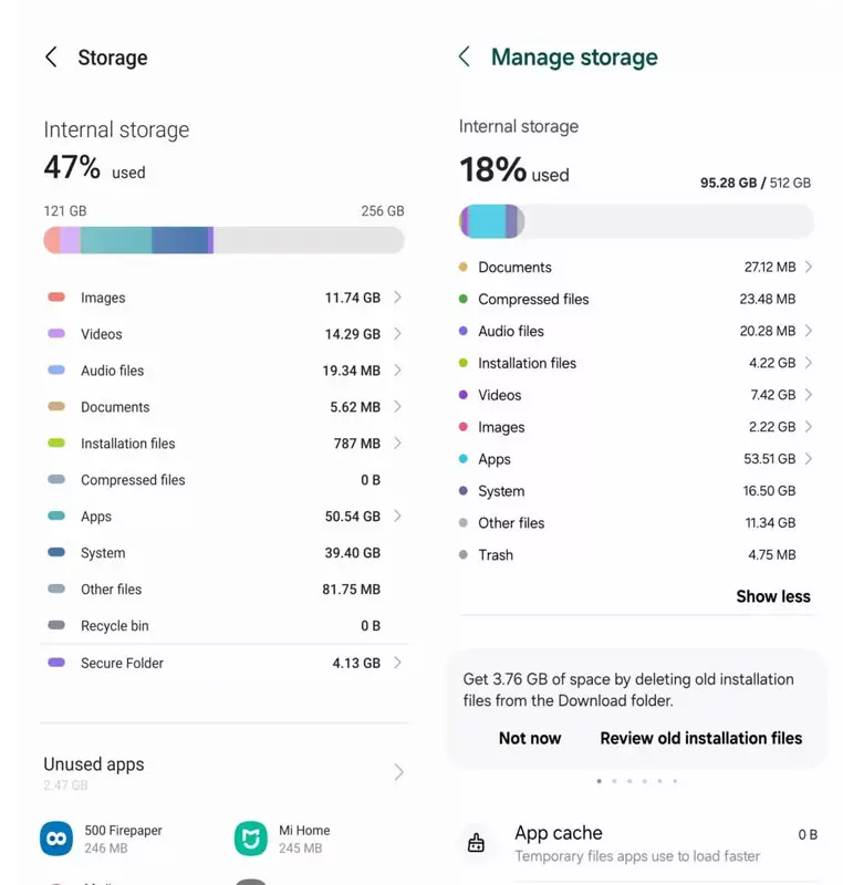
Max Weinbach, a notable figure in the tech sphere, has drawn attention to the revamped “Manage Storage” section within One UI 6. This updated feature offers users a more transparent and precise breakdown of their internal storage’s various partitions and files. To understand the extent of this improvement, let’s compare it to One UI 5.1, the predecessor of this revamped version.
A Visual Comparison
Visual aids often convey the essence of change more effectively than words alone. In One UI 5.1, the “System” partition occupied a staggering 39.4 GB, which raised eyebrows among users who believed this substantial allocation was hindering their available storage space. However, in One UI 6, a more plausible representation emerges, with the “System” partition accurately reported at 16.5 GB. This visual transformation eliminates the previously exaggerated concern over space consumption.
But what about the conversion error once erroneously linked to the “System” partition? In a twist, this error has now been attributed to what is aptly labeled as “Other files.” A microscopic 81.75 MB on One UI 5.1 has ballooned to 11.34 GB on One UI 6. This shift in focus highlights the complexity of storage management and the intricate interplay of various system components.
Peering into the Storage Disparity
While the revamp addresses initial confusion, there’s still a lingering bewilderment. Users teetering on the edge of their storage capacity may still ponder the nature of “Other files” within One UI. In truth, this space is not a tangible entity within the device’s storage hierarchy.

To understand this discrepancy, one must delve into storage metrics. Phone storage is marketed in gigabytes (GB), measured in powers of 1,024, while the actual representation, termed gibibytes (GiB), is measured in controls of 1,000. This nuanced distinction leads to a difference in reported storage capacities.
For instance, a phone boasting “512GB” of storage translates to 512GiB, amounting to 476GB. Similarly, the marketing claim of 256GB corresponds to 256GiB, equating to about 238GB of usable storage. The pattern continues with 128GB, marketed as 128GiB, which ultimately offers around 119GB of practical storage.
Unmasking the Hidden Partitions
The crux lies in the concealed partitions, notably the “System” partition within One UI 5.1 and the enigmatic “Other files” partition within One UI 6. These partitions account for the variance between the marketed storage capacity and available space.
However, even within this understanding, discrepancies persist. For instance, “Other files” on One UI 6 for a device advertised with 512GB storage should hover around 36GB (the difference between 512GB and 476GB). Yet, the reported size remains a fraction of this value. This contradiction could potentially be attributed to the proportion of storage utilized. As users add files to their devices, the “Other files” size may incrementally increase, aligning closer to the anticipated 36GB. This strategic manipulation helps bridge the gap between marketing claims and real-world usage.
Anticipating Clarity
The One UI 6 update, poised for release in the stable branch, holds promise for improved clarity in storage representation. Beta testers are already enjoying these enhancements, and the tech community eagerly awaits the official changelog accompanying the stable update. With this renewed perspective on storage reporting, users can anticipate a more intuitive understanding of their device’s storage landscape.
FAQs
Why was there confusion regarding storage on the Samsung Galaxy S23 series?
The confusion stemmed from a conversion loss error that incorrectly suggested One UI occupied a substantial portion of internal storage.
What does “Other files” represent in One UI 6’s storage breakdown?
“Other files” is a partition that now encapsulates the conversion loss error previously associated with the “System” partition in One UI 5.1.
Will One UI 6 eliminate storage-related bewilderment?
While One UI 6 brings significant improvements, specific nuances, like the growth of “Other files,” might still require user understanding.
When can users expect the One UI 6 stable update?
The stable update for One UI 6 is expected to be released soon. Beta testers are already exploring its features.
How does the storage disparity impact users practically?
The storage disparity is crucial in understanding the difference between marketed storage capacities and the space available for users to store their data.
Wrap Up
In summation, Samsung’s ingenious strategy in redefining storage visualization through One UI 6 is a testament to the intricate art of technological communication. This approach not only rectifies earlier misconceptions but paints a more accurate picture of storage allocation, reflecting Samsung’s commitment to enhancing user understanding.
The company empowers users to make more informed decisions about their device usage and data management by presenting a more precise representation of how storage is utilized. This innovative step not only cultivates trust but also demonstrates Samsung’s dedication to optimizing user experiences in the ever-evolving landscape of technology. As a result, this conscious effort by Samsung propels users towards a more engaged and enriched interaction with their devices, embodying the essence of effective technological communication.

Selva Ganesh is the Chief Editor of this Blog. He is a Computer Science Engineer, An experienced Android Developer, Professional Blogger with 8+ years in the field. He completed courses about Google News Initiative. He runs Android Infotech which offers Problem Solving Articles around the globe.


Leave a Reply